3 Common Design Mistakes and How to Avoid Them
As a designer, it’s easy to see the difference between the work of an experienced designer and a beginner or non-designer. How? There are common mistakes that act as a calling card. Experienced designers have made these mistakes in the past while they first began designing, and have since learned to avoid them to produce better designs.
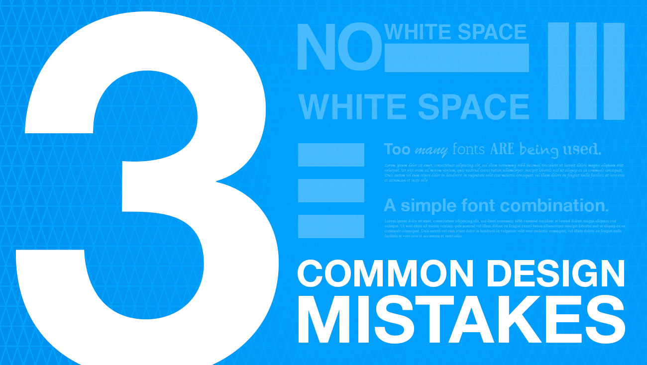
1. Not enough white space
White space, or negative space, is space that is not taken up by text, an image, or a design element. It’s necessary to make your design look clean, organized, and professional. The lack of negative space makes a design overwhelming to the eye and challenging to consume the information. White space doesn’t have to be white. If your design has a black or colored background, the same rules apply.
How much white space do you need? Every design is different. You’ll start to get an eye for catching design that has just the right amount of white space. It’s a balance because you can also have TOO MUCH white space. It comes with experience, and also depends on the style of design you’re using to communicate your message.


2. Too many fonts
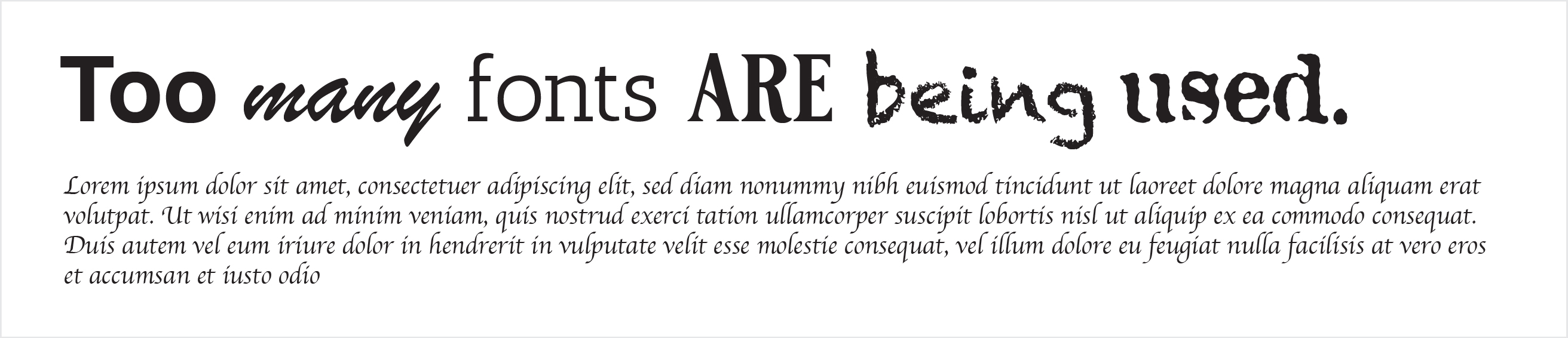
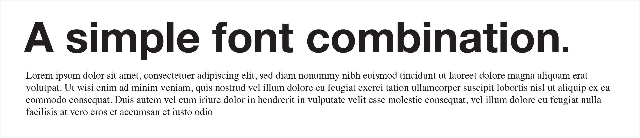
As a general rule of thumb, you never want more than THREE different fonts in a design. You want one font for the body text (paragraphs of text, the main content.) One font for the headline and a third you can use for a sub-headline or unique call-out element.
I usually use only TWO font families (for example: using Helvetica Neu and Garamond). Within those font families, I can use TWO styles (for example, Helvetica Neu Bold and Helvetica Neu Light.) Each of the style variations of the font family counts as your suggested total of three.
Why are designers so specific about fonts and the use of too many? Fonts communicate so much. But discussing what fonts communicate is a topic we will save for another blog post.
3. Bad color choices
If you’re designing something for a brand that already has colors defined in its identity, choosing colors is easy. You use the colors within a brand identity. But if you’re not designing something for a brand and you have full color freedom, choosing colors can be tricky.
I suggest starting with assessing what you’re trying to communicate. Is there a color that psychologically helps you reach your goal? Read our color psychology blog to find out. If so, use that as your primary color, and use either a complimentary, monochromatic, or analogous color scheme.
Keep your audience and goal in mind when choosing your colors. Are you designing a wedding invitation for a classy, simplistic wedding with lots of greenery? You want to choose colors that coincide with how the wedding will look and feel. Neon pink, orange, and green are not the colors to use. A simple color scheme like a sage, light grey and white is going to communicate the feel of the wedding.


The three mistakes above are just a few of many, but avoiding them and following the solutions will make a significant impact on your designs. Designers learn so many rules for two reasons: to help them produce better designs and to know when to break them.
There are always exceptions to the rules, but you can’t successfully break the rules if you don’t know them. Breaking rules is how some of the most impactful and forward-thinking design is made. But for the purposes of a non-designer and beginning designer, following these tips will help guide you in a path of good design until you gain the experience, skill, and confidence to start breaking them.