The Power of Color
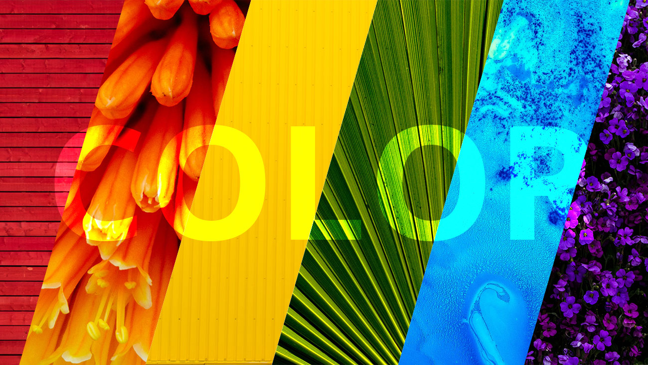
What’s your favorite color? Based on statistics, you’re most likely to say blue. Why is blue so likable? It’s trustworthy. Calming. Safe. The psychology behind color is rarely talked about, but there’s so much power it holds. When one color can make you feel anxious and hyper-aware and another color can make you feel calm and relaxed, that knowledge should be taken seriously when choosing colors for your brand. Let’s take a look at each color and the psychological response that takes place:
Red
Red grabs your attention. It’s intense, and usually creates strong emotions. Those emotions can vary from person to person, ranging from danger to excitement. Red can also be related to appetite, that’s why so many food and beverage brands use this color (Mcdonald’s, Coca Cola, Wendy’s, Arby’s, Chik-Fil-A, Pepsi, and so many more). It’s usually used sparingly to avoid overwhelming customers.
Yellow
Yellow is commonly known for giving off emotions of happiness. It’s used to express creativity, brightness, optimism. Yellow can also make us feel cautious (hence – caution tape and traffic signage) A few well-known brands that utilize yellow and its ties to happiness are Ferrari, Best Buy, Subway, Cheerios, and Mcdonald’s.
Orange
Orange is fun, creative, energetic. It’s similar to red, but with less strong emotion. Home Depot utilizes the color to communicate creativity and excitement to all those DIYers out there. Nickelodeon, a kid’s TV network, uses its fun and creative psychology as well.
Green
The psychology behind the color green is pretty easy to guess, nature and money. They are so closely tied that we use the word green as a nickname for money, and an adjective for things that are good for nature. It represents growth and healthiness. John Deere is one of the most well-known brands that use the nature and growth ties of green.
Blue
Blue reminds us of the sea and the sky. Since we see it so often, it’s trustworthy. The sea can be calming, so we feel calm seeing the color blue. It’s the safest color for brands to use to represent themselves. Most of the largest companies in the world utilize blue like Facebook, IBM, Ford, Dell, Visa, Intel, and so many banks. Who doesn’t want to be seen as trustworthy? Especially banks. However, it’s come to be overused in brand identities. Brands are starting to branch out and opt for alternatives to stand out.
Purple
Royalty has close ties to the color purple, because it was the most expensive color to die fabric hundreds of years ago. Along with royalty, it evokes feelings of power and wisdom. Using too much purple, however, can give frustrating feelings of arrogance (likely how you’d feel a hundred years ago seeing someone dress head-to-toe in purple fabric).


