Understanding Color
Color is an important element in design and branding. Without it, the possibilities for creating unique brand identities and fresh, varied designs would be considerably more limited. There’s plenty of opportunities for design without color, but having the freedom to choose makes design that much more interesting.
The way color is treated in design depends on the space in which it’s used.
Let’s start with the visible light spectrum. Light is comprised of varying lengths of waves, which our eyes read as color. Wavelengths that are on the shorter end of the spectrum are blue, while longer ones are red. We experience color, but it’s really our brains interpreting various wavelengths as color in order to identify different objects in our environment.
Based on the visible light spectrum, we translate color into a few different spaces: RGB, CMYK, and PMS.
RGB stands for red, green, and blue, and is the color space used for screens and the web. RGB has a wide range of colors. RGB is an additive color space, where pixels on a screen start as black and only produce color when light is added. When red, green, and blue is combined, white is produced, and various combinations will create different hues. Due to working directly with light, colors produced in RGB are vibrant. Unfortunately, colors can shift from screen to screen, and not every color is easy (or even possible) to reproduce.
CMYK stands for cyan, magenta, yellow, and black (“K” is used in order to avoid confusion with the “B” for blue in RGB), and unlike RGB, is a subtractive color space that is used for print. Rather than light, ink is used to create color. This also results in duller colors and a smaller color space. Light that is being reflected by the piece of paper is being absorbed, so when cyan, magenta, and yellow are combined, the result is black. Having a separate black ink in CMYK provides more density to the black tones, and also saves on ink.
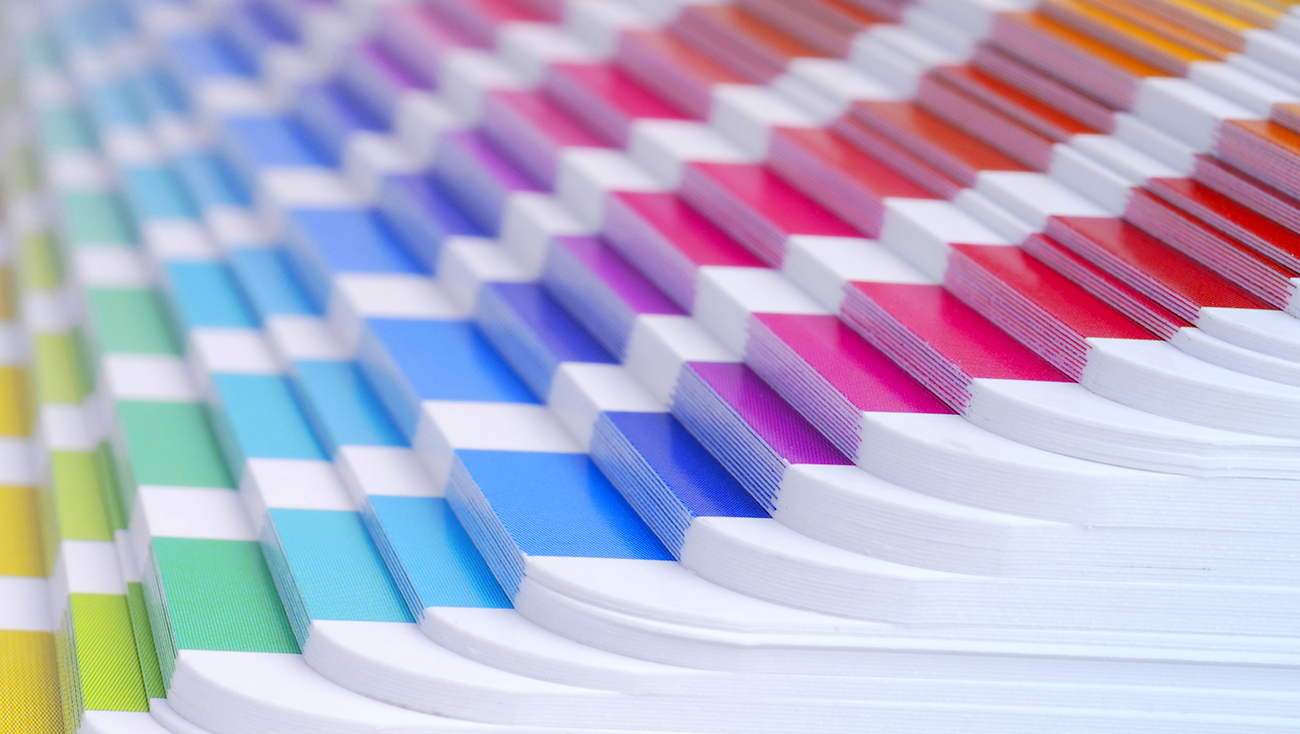
PMS stands for Pantone Matching System, which is also used in print like CMYK. The color space here is small, as special mixes of ink are used to create exact colors.
Each PMS color has a specific formula so that PMS can be perfectly reproduced.
CMYK results can vary among printers that are calibrated differently and are meant to be mixed together (transparent), but PMS uses opaque inks and always has consistent results. Due to this, PMS is recommended for logos and materials where a specific color must be recreated perfectly.
Working with color is fun, and it’s important to understand the differences in color spaces to make sure you’re always using the correct space in order to produce ideal results.