Five Psychological Design Tips to catch attention
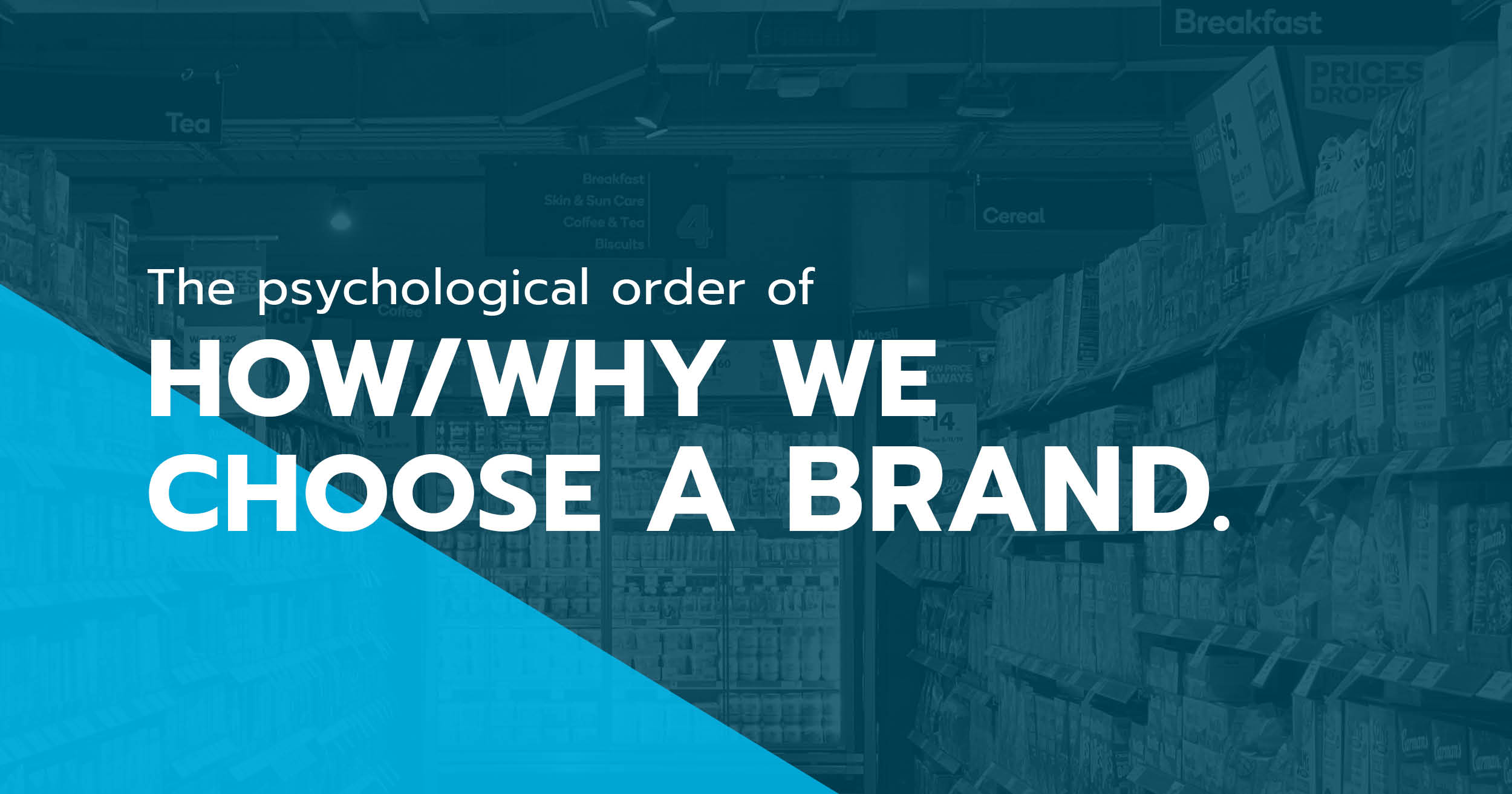
You’ve decided you’re going to ditch the coffee and instead, drink tea. On your way to the tea aisle, you have passed over one hundred different brands of products and more. When you get to the tea aisle, you are struck with six shelves stacked high and three foot wide of space filled with all different kinds of tea brands. Which do you choose? What do you find yourself seeing or picking up first? The five psychological orders in which catches your attention may be why you choose one brand over another.
- Color:
Color is the first thing we see and evokes emotions which gives us insight on your brand. Look at your competitors; are they using the same color? Have you ever noticed almost all fast-food brands use red? Red is an energetic/fast color that evokes hunger. Although, if you want your brand to stand out, you may consider using different colors from your competitors that still associate with how you want your audience to feel about your product. - Shape & Structure:
The next thing we notice is shape. Picture it: you’re driving down the highway, seeing billboard after billboard and then boom, there’s a billboard that suddenly catches your attention. Maybe it’s because part of the image is no longer inside the basic rectangle we typically see, but instead hanging outside of that rectangle. Now that you’ve noticed something different, you’re hooked and want to know more. it’s the same idea when shopping at the store for any product, like tea. Most tea is sold in a rectangle/square box. If you all of the sudden notice a cylinder shape package on the shelf, would you pick that up? Most likely, because it’s different from the rest and your brain is alerting you that something is not like the others here. - Texture:
When you pickup that tea box, what do you feel? Is the cylinder soft and smooth? Or is it a basic cardboard texture like the rest of the products on the shelf? Texture is a small detail that will keep your audiences’ hands on your product longer and increase the likelihood that they will take it home with them. It gives them that unique experience with your brand. A few cool textures that are pleasant to touch are matte, silky high-gloss and soft or fluffy. - Typography:
Fonts evoke emotions. Fonts give your audience more understanding on what your brand personality is. A script or handwritten font can make your brand look playful, rebellious, or youthful. A san-serif font is going to make your brand come off feeling modern and direct. A serif front will make your brand feel expensive and elegant. Again, it is important to look at your competitors and see what fonts they are using and how your brand can use a different font to stand out. - Copy:
When your potential customer has already gone through noticing the color, shape/structure, and texture, they are now ready to read what your brand has to say. Some questions that may pop up in their head at this point are: What are the features? Does this product align with my values? Why should I buy this? When it comes to copy, keeping it clever and simple is key.
I hope these tips will help you as you consider how to make your brand stand out from your competitors, whether its in b2b sales, the service industry, or selling a product like tea.